(Python)Visualizing 22 years of Premier League data scraped from Wikipedia.
This post work
focuses on visualizing the data of Major Premier League clubs 12 clubs which are
represented above by colored lines. I
Scraped the Data from Wikipedia because i was unable to find raw and
reliable data containing match data of 22 years at a place. Also, it is
difficult to do get in match details like the Top goal Scorer and
top goals scored data from different sources.
Inspired by the Anna
Powell-Smith's work http://www.thestoryoftheseason.com/
work on
timeline of Premier Series.
I came
up with idea of drawing this graph using d3.js being a noob at d3js i am was comfortable in using plotly
I used plotly which
has a python library to plot the graph on Web.
I wrote this script to scrape data
from Wikipedia Tables
I am planning
to write a detailed blog post on the entire 'scraping' part of the
project in near future.
Script is completely in python I am
using Beautiful Soup to scrape the Wikipedia pages .
this Github rep contains
all the files i used to create the plots .
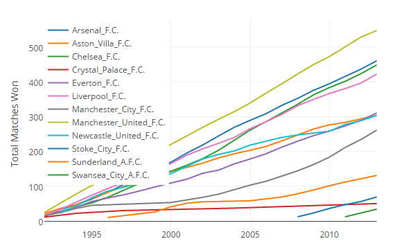
the following plot shows the
cumulative matches won per year by the teams
it shows the scoring
trajectory of the teams .
the graph below shows that Manchester United has a constant growth curve where as Manchester City has steep growing curve


0 comments:
Post a Comment